
“Retread Threads: Frieze Sleeves Leave Us Shamrock Weary Instead of Shamrock Cheery”
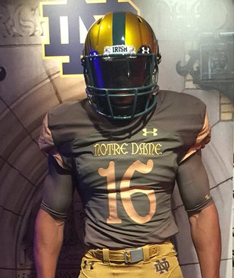
The wait is over. We now know what the Notre Dame football team will be wearing against Army in San Antonio later this year for the annual Shamrock Series game.
Here they are:
Introducing the 2016 #ShamrockSeries Uniform by @UAFootball
We’ll wear it with pride on Nov. 12 vs Army in Texas. pic.twitter.com/7qOfdzpdHB
— Notre Dame Football (@NDFootball) July 21, 2016
Our Shamrock Series helmet logo, it appears. pic.twitter.com/GQlG3O74Zi
— 18 Stripes (@18stripes) July 21, 2016
FIRST LOOK: Notre Dame “Shamrock Series” uniform pic.twitter.com/87K52YaiMt
— Darren Rovell (@darrenrovell) July 21, 2016
☘ You’ve seen the team’s jersey. 🏈
Now get yours.
2016 #ShamrockSeries Jersey
BUY:https://t.co/G6yxEmGc53 pic.twitter.com/4RomZEhSbi
— The Fighting Irish (@FightingIrish) July 21, 2016
#2016ShamrockSeries is looking great this year #Army #America #MilitaryGreen pic.twitter.com/dEcBLCKsZr
— Adam Myers (@adam_nd_myers) July 21, 2016
Well, they aren’t awful I suppose. As a noted uniform connoisseur I can find plenty not to like.
*For the third straight year Under Armour forgoes any white trim instead continuing the (dumb) trend of slapping two colors on top of each other without outlining. You want to know why it’s so hard for people to make out the shades of colors when you unveil things like this? There’s no white to bring out the colors!
*Related, apparently lessons were not learned from last year’s poor lighting at Fenway Park. Last I knew the Alamodome didn’t have the best lighting, even for an indoor stadium, which means absolutely nothing will pop on this uniform (especially without white trim!) and numbers/logos will be difficult to make out. The flushed out green and sandstorm-ish gold doesn’t help either. Odds are, these uniforms will look very, very dull on the field.
*The school went with the WWI memorial frieze above the east door of the Basilica as the logo for the helmet and shoulder sleeves. Again, there’s no trim on the sleeves and the helmet logo is in some weird brushed-on motorcycle helmet style. Since it’s so ornate both logos will be tough to make out unless the camera if right on top of the uniform.
*I can’t but help but think these are basically a slightly updated, but ultimately retreads, from the 2014 Shamrock Series uniform. One look at the replicas from that season and this is like a tweaked green version, except it’s trading a monogram and Gothic pattern for the WWI frieze.
*There’s an American flag on the upper back which, I believe, marks the return of the stars and stripes on the jersey for the first time since the post-9/11 years. The jersey and numbers font all appear to mimic that used on the WWI frieze, as well.
*There appears to be nothing of note from the pants on downward. Outside of getting the frieze on the uniforms there doesn’t seem to be much effort put into these. Which is probably my biggest problem. Say what you want about last year’s offering at least it tried and had some character! Under Armour has been frustratingly boring with the exact same standard uniforms for 3 straight years now and this Shamrock Series offering will ultimately fall into the forgettable bin.
*We’ll have to see how the whole thing flows in the flesh on the field. I don’t mind the helmet being so much brighter (no different than the standard uniforms) and the shades everywhere look fairly uniform. Either way, Army is bound to have better uniforms when we play them in a few months.
I didn’t write that intro. 🙂
Also, I hate the whole “grab a theme from campus” designs. Really sets the tone for a lack of creativity. Even if we’ll hate it try something new. Try something fresh!
I like the font…got that going for me so that’s nice…
I agree with Eric that as a total composition it’s largely uninspiring – the colors are just too dull. But I’ll cast a vote for the helmet – I think it’s pretty cool. I think the effect will be that from far away it looks pretty normal, but up close you’ll see the ghosted design. One vote yea.
I just wish it had some of that sweet, sweet, ‘mouflage I kept hearing about.
i am amused
I likewise am smiling
The shoulder frieze and that on the helmet look from afar like a tattoo, yes? I’m thinking it will look like a bunch of bald, sleeveless guys with tats running around on the field.
Decent idea, not the greatest execution. I get that ‘croots like alternate unis, but I’d imagine that ‘croots prefer alternate unis that look GOOD. Agree that they need white bordering, and I think the helmet, while a nice idea, looks almost copper, and the ghosted design will just confuse people.
Well, I know what I hate, and I don’t hate these. I’m with Brendan on the helmet; it’s pretty choice.
I like these better than the 2014 edition, but agree with Eric that the theme / creativity piece has been lackluster for a few years now. I wonder how much of that is UA versus the University – I could see them presenting 2-3 options in terms of creative themes for the Shamrock Series game the athletic department / administration going for those with the biggest traditional tie-in or storytelling component instead of something that just looks awesome. There’s too many good color combination possibilities just in the green/navy/white/gold (maybe black if you go crazy!) that haven’t been touched yet.
I really like the helmet. I think it is very cool up close and gives you a lot to check out. You won’t notice the details on the field, which I think is good. I really like stealing a theme from around campus. ND has some awesome architecture to rip off. I think this helmet is almost as good as the 2014 one with the dome style pattern in the gold. That is my second all time favorite helmet after the current every game obnoxiously bright under the lights gold.
As for the uniforms they are blaaand. But I prefer that to all bright green. I also get what they are going for. They look fairly military, without being disgustingly ooooh we loooove the army even though you are our opponents. The drab colors might have actually looked great with some white bordering.
I think the sleeves look silly when not on pads, so I would never buy/wear the jersey, but think they look decent when shaped by the pad.
Jersey: Meh, which is pretty good for the SS. Helmet: Great, and I have really liked most SS helmets (minus leftrechaun, barf barf barf). Overall: Above average for SS. Think they could have been great with that white bordering.
CCfkaMotSSR
I think a cool campus theme would be an entire jersey designed like the main building.
The shoes and socks could be slate colored (or whatever stone is used) and designed to look like the steps, then the pants and torso could be the distinctive yellow brick, then the shoulders be the distinctive dark blue/grayish green striped roof pattern. Then the helmet would be a rip off of 2014, but probably with no stripe or ND, and of course with a statue of Mary on top.
“Statue of Mary on top.” Hmmm, where have I heard that before?
For me the detail on the helmet is why I don’t particularly care for it. From a distance it will just look like a big dark smear on both sides of the helmet. I am sure that NBC will have 87 segments about it during the broadcast to make sure the audience at home knows what it is though…
What are the odds that a future Shamrock Series could involve some sort of alteration to the playing field, a-la Boise State?
HEAR ME OUT
All navy uniforms (with some white trim and gold or green numbers)
STAY WITH ME
On a gold field.
It would probably be hideous, but if we’re leaning into non-traditional for one game, why not go balls to the wall?
I’ll just sit here at work and collect my thumbs upses
Just need 1 million dollars for one-off turf.
That’s only if you put down a whole new playing surface. For one game, a temporary gold paint job would be quite feasible.
If a football field is 360 feet long and 160 feet wide, that’s a total of 57,600 square feet. According to Krylon’s FAQs, a 5.75 oz can covers about 5 ft², so let’s call it one ounce of paint per square foot per coat. Pioneer Athletics sells field paint in cases of 12 cans at 22 ounces each for $55.50 per case for 100+ cases of their Specialty Colors” (including Old Gold and Vegas Gold, so we’ll assume they could make us some special Grey Poupon Gold if we asked really nicely).
60,000 ft² / 22 oz per can / 12 cans per case = 227 cases × $60 per case (tax & shipping, yo) = $13,636 per coat
Obviously, more than one coat might be needed, but even 10 coats would cost less than $140,000, or less than $2 per ticket for that game.
Here’s what I have to say to that idea, ricke002:
I was originally suggesting the idea in jest, but (mostly because Kenny is in on it) I’m starting to like the gold field more and more.
Plus, as CSN has now laid out, it’s almost stupid if ND doesn’t spray paint their field gold.
Hey, if it works for keeping my lawn nice and green in the heat of the Texas summer, how can it not be a great idea for a giant carpet playing surface in northern Indiana in the Fall?
It almost works for Soldier Field Aug-Dec (I don’t remember what the field looks like in January — haven’t been too many games there recently in January)
You’d make it up so fast in replica gold fields, though.
Gold field? Everyone would think it was dead grass and wonder why we can’t keep our turf growing.
UA clearly doesn’t want to rock the boat (or perhaps ND has specifically told them not to).
These don’t actively anger me, which is all I ever really want from Shamrock uniforms – ND’s regular unis are too good for me to really be in favor of any alternates. The helmet design is sort of cool, even if it won’t be visible from a distance.
It’s a relief that they chose a faux-military green color rather than incorporate any kind of camo, which would have been incredibly cheap and garish in my opinion.
Those are…meh. Not terrible, but not good. Can we please stop doing to contrast sleeves on alternate uniforms? It just looks dumb.
I actually like ’em. Agree with the sentiments above that either UA and/or the University obviously doesn’t want to go full Oregon with these (never go FULL Oregon)…
I think I would have preferred a brighter green than what is here, but who knows, maybe that would have contrasted too poorly with the gold and the other elements. Not too much of a designer guy, but I don’t think they’re horrible.
More importantly though, I’m not in the target audience of the 16-22 year old players that they want to think these are sweet. If they dig it, then that’s good enough for me.
Nah, go full Oregon.
None of our alternates come close to 95% of Oregon’s plethora of uniforms.
Like most Under Armour stuff, it’s somewhere between meh and blech. The shoes, the shoes, it’s all about the shoes, UA. They just don’t get that. They need to stop the bleeding, shoe wise. First just get us some shoes that aren’t hideous, UA. Then work on getting us some that are actually attractive.
Overall I like last year’s Shamrock unis much MUCH better.
Hello, glad to see everyone.
Unis are pretty drab. I say take it out on Army.
You made it. 🙂
Good to see you here tlndma!
Drab, but not quite olive drab.
It would be cool if Army likewise paid tribute to when this was an actual rivalry, and wore black and white uniforms.
I think the color scheme is pukey and the helmet is ridiculous and I would like to formally issue a request for everyone to remove their persons from my front lawn effective immediately.
HARRUMPH
I think next year we should try out a mystichrome type helmet, you know the shifting color from blue to gold to green.
https://www.google.com/url?sa=i&rct=j&q=&esrc=s&source=images&cd=&cad=rja&uact=8&ved=0ahUKEwiD5ZeP14jOAhXK4IMKHQ6uDMAQjRwIBw&url=http%3A%2F%2Fwww.mustangperformanceparts.biz%2Fmystichrome-2004-ford-mustang-svt-cobra%2F&psig=AFQjCNFYTQ-5yOXKSVvFqB_yon8WvmPyjQ&ust=1469332173297028