
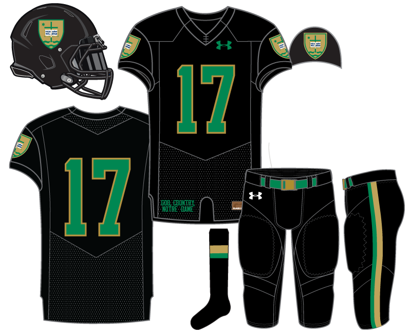
Today we publish our 9th Notre Dame football uniform concept and the second of a handful of Black for Black’s Sake designs from our collection. Our first effort explained some of the challenges surrounding using black with the Fighting Irish colors in addition to some of the modern bells and whistles usually seen on black uniforms that I don’t personally love in most cases.
This effort will break a couple rules. First, the lack of white as a trim color. If you want mostly black well here you go. Secondly, the same color pants as the jersey. I really don’t like this look on 9 out of 10 uniforms and yet 90% of concepts these days match the jersey and pants.
Without white the challenge was to get the colors to pop on the black background, also mentioned in the first black concept. Using a brighter green outlined in gold we feel like it’s a scheme that really came together well.
The highlight of the design is the use of the shield from Notre Dame’s academic seal. In reality, it’d probably never be used in any athletic function but it’s a pretty strong logo and a fun contrast with a modern black uniform.

Father Hesburgh swagged out with his shield blazer patch.
The shield is placed on the shoulders and helmet while the rest of the uniform is relatively unadorned. With the black jersey and pants we tried to avoid the ‘leotard’ effect as best as possible while keeping the overall uniform simple and black dominant. A traditional two-tone pant stripe felt necessary as well as using a green belt with gold buckle to break up the black monotony just enough to let everything breathe.


Go Jags!
Wait, why are we mimicking the worst franchise in all of sports?
Cause we’re not?
There’s probably 30 other uniforms that this concept looks more similar to than the Jags. Primarily because Jacksonville wears teal and not green.
Do not like the look of the helmets, the rest looks solid. I think I’m just not liking the shield. Maybe replace that on the helmet and shoulders with something else and I would like this more. I also am a big fan of the matte black helmets teams have been using, so I would like that here.
I like the idea of using the shield a lot, maybe it’s a bit overwhelmed being on a black background though. I do agree it doesn’t quite seem like a perfect match, but as an idea I dig it. Maybe put this shield on the all-white design from earlier (either shoulders or chest) and I bet that would look sharp.
https://18stripes.com/notre-dame-uniform-concept-golden-dome-icy-whites-2017/
I do love the all black concept and, unsurprisingly since I’m a Pittsburgh fan, I wouldn’t even have minded having a slight variation with making the numbering/font gold with a green outline instead of the design here of green + gold outline.
Yeah, I think it’s possible I would like the shield, just not in this case. Something about the green in it looks weird to me too.
Agree, I really like this if you took the shield off the helmets (maybe replaced with shamrock… or just leave blank).
IMO, most of the helmet concepts that are different than the traditional lids Notre Dame has worn won’t be embraced by the majority of fans. It’s just how Irish fans are hard wired.
E, is there a reason you didn’t go with the colors from Fr. Hesburgh’s patch, instead of the green? They might look pretty nice on the black background. That powder blue and gold with white accents could work. Make the numbers powder blue outlined in gold. I don’t know.
Yes it would’ve worked well with the different scheme. I do have a light blue/yellow concept where I might fit it in now that you say it.
Cue the cries, “What are we UCLA?”
The UCLA-Jacksonville Bruinguars.
I think it would be better with a brighter green, or especially gold. A little more yellowy gold. It just seems a little dark on dark to me.
That’s what happens when white isn’t used as a trim color. Very dark! But some people love that.
People like blood sausage too. People are morons.
Well alrighty then.
Want some blood sausage? I have some here in the glove compartment.
I like to say a prayer and drink to world peace . . . Amen.
As a proud ROTC alum, I love the school shield emblem. It was our “unit patch” for ROTC that went on our uniforms, so I’m predisposed to liking it.
Outside of the helmet logo(I just dont like the idea at all unless it’s the interlocking ND) I absolutely LOVE this concept. Easily the best one of the series so far. There’s a reason so many teams are going all-black or have it as a third jersey. It looks incredible on TV and this would do the same for us. Amazing design.
If it was with the traditional gold helmets, I’d say it was your best one yet!