
In early March I had the pleasure of going through Clint Glaze’s definitive Notre Dame Uniform History website chronicling over 100 years of sartorial splendor. At the end of that post I mentioned that we’d roll out some uniform concepts and we’re debuting design number one here today.
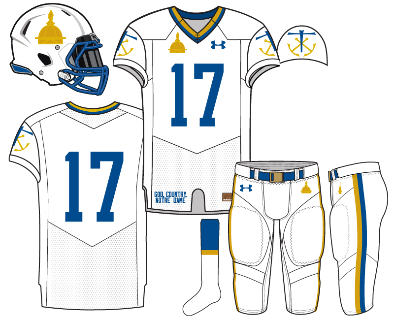
I always feel like the best concepts are made when you have at least 2 concrete ideas that you know will blend well together. With our first concept I think that was the case with an all-white look and golden dome logo.
As Texas, Penn State, and the 2013 Shamrock Series* uniforms can attest all-white is almost always A) wildly popular and B) pleasing to the eye.
*Even though it’s a low bar to clear I’m fine with the ’13 Shamrock Series uniforms being the best of the bunch. But, I do think the sum is greater than its parts. The fatter, juvenile shamrock was used, the jersey had those tacky Adidas iron-on metallic applications, and while the color scheme worked really well inside Jerry World technically it wasn’t a full all-white uniform set.
I wanted to put together a full all-white uniform.
In the past when we’ve done uniform concepts we tried to keep the gold helmets. People tend to freak the crap out otherwise. Don’t worry for the majority of our concepts will have gold helmets.
For this concept a white helmet with the golden dome just fits. It feels so right. Can you really complain that the helmet isn’t gold when the reason the normal helmets are gold is the logo for this? Also, should Notre Dame maybe scale back the abundant use of the monogram in favor of the dome logo? I vote yes.
I chose a lighter blue because my personal taste skews towards bright colors and in this concept it helps bring out the gold and keep the overall uniform fresh in its whiteness.
The last minute addition after some research was the Holy Cross logo on the shoulder sleeves. Is a cross too much, even for a Catholic school? Perhaps, although technically the CSC logo was on last year’s Shamrock Series uniform amid the clunky indecipherable frieze off the Basilica. Anyway, I think the logo fits in well to this overall scheme.
Next concept up Irish Whiskey Sunrise…


I love the idea of the dome on the helmets. I think the all white is a solid concept too. I know you mentioned wanting to roll back the use of the monogram, but I think I would prefer that on the shoulder pads over the CSC logo.
It would ruin the nice clean concept of this uniform, but on a different design, I would love to see “God, Country, Notre Dame” more prominently displayed. Maybe where you have the dome and UA logo, with Notre Dame underneath that (although I guess you’re never going to get that UA logo moved). Hmmm, this uniform design thing is a little tougher than I imagined.
We have “God, Country, Notre Dame” more prominently displayed on an upcoming concept!
I wholeheartedly agree with using more of the Dome logo over the monogram ND. I love the Dome, think it is wildly under utilized by ND.
My only problem with these jerseys is that the HC cross made me think of an anchor reminding me too much of those Navy alternates. Of course, I loved those jerseys (and love these ones), and would be fine stealing everything about them, if only we had done it first.
I definitely think you guys should mock up some of the long sleeve undershirts, those have been some of the best parts of the shamrock series unis. In this case I would go super bright shiny gold. Or possibly all white, with a silhouette of Alumni Hall in green on the chest.
I added the Navy pic. I also took some inspiration from their (better, IMO) more recent all-white uniform from Under Armour.
I’m okay with a uniform reminding you of another uniform. Especially if they’re both cool.
Do you have a link to the more recent ones? I almost always love Navy’s uniforms.
And yeah, the reminding is fine, it was just that it actually looked like an anchor to me. So more than just reminding, if that makes sense.
These jerseys are seriously awesome. I feel like they should legitimately be put in front of ND or UA. I am pretty sure I have seen Kevin Plank comment on some of the 18S AD articles, so maybe he reads these family friendly ones too. KEVIN MAKES THIS HAPPEN!
I don’t know why it’s not embedding.
Those are sharp. I like the helmets from my pic more, with the blue anchor, rather than gold, and the more upward angle of the color. But those shoulder and pant stripes are excellent. I especially like the thicker pant stripes.
Yup, the first helmet is an all-time great. I don’t think I’ve ever seen a helmet get such a universal praise.
But I too like the second uniforms more. I never liked the Nike Flywire collars. The second set from UA, modeled after their dress whites, is amazing.
The second set is def an inspiration for today’s concept, which is partly why I didn’t go with a darker blue.
I initially had the same impression, that they were Navy anchors.
Nice concept. I’m totally on board with the idea of using the dome logo more. For my tastes the jersey itself is just a little too busy with the two shoulder logos, God Country ND on the bottom and the obligatory UA mark plus another dome on there for good measure on the front. Obviously can’t run from all of that, but I think I would prefer it a little more plain. I also generally like the more traditional blue than this brighter tone, but that’s just me being cranky. They would probably look really fresh for a night game. I’d give a 7.5/10 overall, interesting concept and one I would like to see used sometime.
Hope there will be some green concepts in this series as well, looking forward to seeing them all!
Also, will the editors accept a fan submitted camo jersey? 🙂
I think the concepts always look a little more busy than in reality. That front view especially gives the best angle possible to see everything. But on the field, you’d seldom see everything all at once and it’d feel a lot less busy.
We’ll accept fan submitted concepts only after completing our 3-week anti-camo workshop.
Bring back the dome!
If you don’t have anything nice to say, don’t say anything at all…
So I won’t.
ALTHOUGH, I will say, I like the all white as a starting point and this is a fun exercise, so thanks!
You said something nice!
Don’t worry you won’t hurt my feelings with criticism. It’s fun for me. Concepts will always be hit and miss.
IMO white and green works better than white and dark blue. 2011 Under the Lights forever and ever amen
Ain’t no dark blue here!
But I like green/white better too. For the most part.
NOOOOOOOOOOOOOO NO NONO NO NO NO NO NO NO.
I’m not an anti-uni change guy, I really like when we do the greens and the SS jerseys and I think if the university ever wanted to change our look, I’d be on board. But these are just awful.
The logo on the sleeves looks way too much like what Navy does with their logo and I don’t think we need to be copying them at all. The Golden Dome as our helmet logo? Ick. And the tones for blue and gold you’ve chosen I’ve never liked. The Chargers look wimpy when they use the powder and yellow as well.
I vote a big no on these
Are you that anti-good taste guy instead 😉
I don’t think the anchor = Navy is a huge deal given the fact that our standard uniforms sharing far more similarities with them.
These aren’t Chargers colors, either.
I like that you’re doing this, it’s fun to have the ideas out there. I just really dont like THIS one. I’m interested to see the other ones you’re going to post, hopefully those give me a better impression.
And, ok, they’re not EXACTLY chargers colors, but they’re pretty darn close. I ran a color spy and got a value of #5D81BF when I looked at a chargers powder jersey and i got #004B8D on your jersey. This is what they look like side-by-side:
Preeeeeeeeeetty close
If I do the normal chargers threads, it’s even closer a match.
Chargers have used ~4 blue colors through the years. This concept probably most resembles their least worn early 80’s blue. I’m not sure which blue you’re referring to, I’m assuming the powder blue which is what most people probably think of for SD.
Then, the Chargers haven’t used this gold either.
I love the all white and the prominence of the dome. I don’t love the chosen blue. This is coming from a Moeller guy who still has an affinity for Gerry Faust for personal reasons, but I’d rather never see the Madonna blue on a Notre Dame jersey again. With going all white, this would still be unique if it used the current blue.
The CSC logo looks busy. Looking around a real-life usage, it appears it usually shows up as a solid color. I wonder if that would help.
That helmet, though. Beauty.
The CSC logo is funny part of the final design.
My original idea was virtually no gold anywhere on the uniform except for the dome on the helmet. The first mockup looked way, way too much like Penn State. So we added more gold to the rest of the uniform. Creating the stripes on the collar really helped make it more ND-like, IMO.
At that point, using the two-colored CSC logo seemed best.
So, Pagano has cancelled the rest of his visits with the exception of Oregon? This could be really good for ND.
He basically said that he is transferring for playing time. At ND, he can have all of the playing time.
I think these are terrific. The university should use these. The collar and pant stripes are inspired. I don’t love the sleeve, for the reason mentioned above that the logo looks like anchors. That’s minor quibble. Question for the designer(s): How will these uniforms coordinate with the Leprecleat?
Leprecleat…the good ole days!
Everything goes well with the Leprecleats™!
No, I do not like these. I don’t mind the concept of an all white kit, but I definitely do not like the dome as a logo. I actually kind of like the csc part, though it does remind me of Navy.