
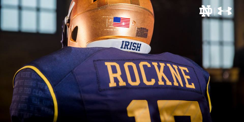
There will be no Shamrock Series game for 2017 but that doesn’t mean Notre Dame is taking a year off from a one-off alternate uniform. On Friday afternoon the school released the “Rockne Heritage” uniform to be worn for Senior Day on November 18th against the United State Naval Academy.
Let’s review ’em!
CONCEPT: B+
This “fauxback” uniform has its heart in the right place. With the school opening the renovated stadium it made sense to honor the coach who was so instrumental in getting the structure built in the first place. The school did dedicate the stadium in 1930 in the game against Navy (the opener the prior week was played inside Rock’s House against William & Mary) so there’s a connection there.
Using the uniforms in the first game against Temple would’ve felt more symbolic for the opening of Crossroads–the Owls are even an Under Armour school and could wear something commemorative too! Waiting until game 11 just feels weird, in addition to Navy having similar colors. Let’s hope the Middies also wear an alternate uniform that offers plenty of contrast.
HELMET: A
Last year’s alternate uniform had a helmet that didn’t work too well. During live action you could tell there was something on the helmet but it couldn’t be made out until you’re right on top of it. Either make something that’s visible during action or subtle enough that you think it’s a regular helmet but isn’t.
This helmet nails the latter route. It appears they’ve added a little bronze touch to make the helmet appear more like leather and there’s a subtle effect to the helmet so that it looks like an old-timey helmet from the Rockne era. This should look tremendous on television during the games and equally impressive in someone’s office.
JERSEY: B-
The merchandise shots on Notre Dame’s website shows more of a sandstorm gold which doesn’t look very good and too much like the 2014 Shamrock Series jersey. The promo shots show a much more lively yellow-gold that looks so much better.
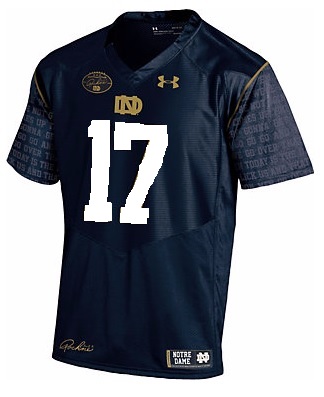
You guys know a pet-peeve of mine and it’s back again: lack of white trim. For the record, the 1930 Notre Dame team worn blue jerseys with plain white numbers. Doesn’t THIS improve the look a little bit?
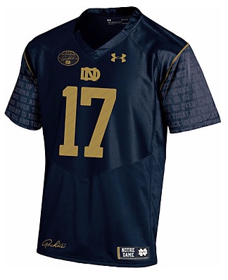
I love the Rockne (player) era monogram at the base of the collar and the the signed patch logo on the right patch. It’s a football logo! Although, kind of weird that they put the same monogram a few inches away from each other.
I don’t like the Rockne speech on the sleeves both because so much script in a tiny area looks odd and the lack of a logo or TV numbers looks out of place.
The biggest criticism I’ve seen so far is the Rockne nameplate on the back. I agree, because the nameplate doesn’t really lend itself to a fauxback feel and everyone with the same name is pretty cheesy. The 3 stars symbolizing Rockne’s 3 national titles on the upper back are fine but do look a little militaristic and Navy-like.
The jersey finishes strong with a subtle pattern inside the numbers:
Fans will find the 18 slashes inside the numbers on the back and front of the new Navy game jerseys, designed to echo the end zone markings which have been found for generations beyond the goal line at Notre Dame Stadium.
18 STRIPES!
CLEATS: B+
You have to like the effort here which is admirable, and honestly an upgrade over the usual tacky offerings from Under Armour. In the video promo the cleats look really brown while much more golden brown in the promo pictures.
We haven’t been able to get a good look at the pants or socks but from the glimpses they look traditional.
OVERALL: B+
The real final grade will come after we see these on the field, they should be among the sharpest alternate uniforms in recent memory. For one, wearing the uniforms inside the renovated Notre Dame Stadium should give them a boost as opposed to the Alamo Dome or Fenway Park.


I’m giving it an A+ for that promo video. I’m pumped for the uniforms and the game.
I’m also 4-5 drinks in at the Laguardia lounge waiting for my delayed flight, so keep that in mind. Just getting ready for the season.
4-5 drinks seems about right to get ready for Temple 🙂
I’m with a B+ overall grade, sounds about right. Hopefully the shoes and helmet (definite strong points) look as good on the field as they showed in the reveal, I was impressed and liked both of those aspects.
Total agreement on the Rockne nameplates, I see no good reason to really hammer home that hard what this concept is going for. Putting his name on every single jersey just feels…..inauthentic is the word I come up with. To the period of what they’re going for, certainly to the man it attempts to honor, to the University and to the football program that doesn’t typically use nameplates at all, this feels needlessly excessive and again, inauthentic.
That said, they’ve done worse in recent years and props on the overall look. Good point about actually using the alternates at ND Stadium and not at a neutral site like usual. That’s a great touch which adds to the mystique.
Yes, inauthentic is a great word for the nameplate.
Promo video is great. Uniform is well above average. This is a win.
NAME ON THE BACK??? MAKING MONEY OFF OF STUDENT-ATHLETES??? ND NEEDS TO FORFEIT ALL GAMES ROCKNE PLAYED IN!!! HARRUMPH!!!
The cleats are an A+.
This uniform is well done!
The only thing I don’t like is having “Rockne” on the name plate. Either have the player’s name or nothing at all.
I absolutely agree about the nameplate. It is not necessary at all, especially given the patch on the front of the jersey and the “title,” the Rockne Heritage Jersey. We get it. You don’t need to also add the nameplate, too, particularly since ND does not use nameplates. The distain for it seems universal from what I’ve read. Maybe by the time the game rolls around enough people will have expressed their dislike that the powers that be will take note and remove them (which seems like a very easy modification, at least for the team’s jerseys, maybe not for the ones sold in stores.) That would be one benefit of waiting until the end of the season to use them!
I really like the rest of the kit, though, including the script on the sleeves. Very different and unique, but subtle, too.
Eric, I have to disagree with you on the white numbers. Generally, I agree that you need some white, but I don’t think that it would work on this one. The consistent gold looks much better imho.
By the way, the picture in the post is our fusion slider and has a bunch more photos. Not sure if everyone noticed. If you hover over the arrow to cycle through pops up.
Carry on…
Thanks, as I did not notice and now appreciate all the pics.
re: comment about Navy contrasting unis — they will be in white jerseys, no?
Yes, I’d imagine so. Let’s hope for blue pants too.
More like brown pants when they see they’ll have to line up against the undefeated machine this team will be at that point, amiright?
/weeps quietly into hands.
Nice eye for Detail, E. When I first saw these, I thought they were phenomenal and was between A and A+. After seeing a few critiques, I’ll probably hedge down to A/A-. Really nice threads, but useless nameplate and would have looked better with white numbers.