
I’ve been on a quest this summer to find the most awful logos in sports. I didn’t have a ton of rules except I didn’t want to include American colleges, you had to be a current franchise, and I held some of the major North American sports to a much higher standard than other teams across the world. Minor league baseball alone–a world where the silly, goofy, and cartoonish are the standard–could have filled 90% of this list very easily.
Let’s get to the amazingly bad!
25. Detroit Pistons
Is it fair to say the Pistons are one of the more storied franchises in the NBA? At least, they are one of the older ones as they’ve been in Detroit for over 60 years. Can’t someone make a decent logo with an actual piston? This throwback to their 80’s logo is not good.
24. Nebraska Danger
This is a team from the Indoor Football League who decided they wanted a logo that best resembles a second-tier kids ride at Six Flags. Actually, did they nail their clientele?
23. Jacksonville Jaguars

If the 2010’s have taught us anything it is that going more life-like with animals really doesn’t work. This re-tooled logo from 4 years ago is by far the worst in the NFL.
22. Detroit City FC
Is the “Spirit of Detroit” statue pretty cool? It’s okay. Am I the only one who looks at this logo and sees the statue doing Ace Ventura air humps? Plus, the arms breaking past the background shield are an odd twist.
21. Vegas Golden Knights
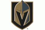
A handful of NHL teams (Phoenix, Dallas, Winnipeg) deserve mention for this list. The country’s first major American sports team in Las Vegas could’ve gone with maybe a million different logos that would’ve bested this boorish and generic video game attempt.
20. Oklahoma City Thunder

The “Thunder” is a cool name but hard to implement. I’ll give OKC a little bit of a pass there but come on, you guys. This logo is such a poor attempt the franchise should be forced to move back to Seattle.
19. Harlequins
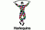
Full disclosure I secretly love this silly logo, especially because it’s for an English rugby club in Twickenham, London. Do they wear diamond patterned uniforms? You’re damn right they do!
18. Indianapolis Indians

I dig the colors and Native American designs here. I also feel like this logo was borne from a bad acid trip and will haunt your nightmares if you stare at it for too long.
17. AK Bars Kazan

This Kontinental Hockey League logo is a combination of an evil 1980’s Latin American cartoon cat with an Rome side-street tourist colored banner. The Russian letters are just the cherry on top.
16. Kilmarnock FC

Look at this thing, no really look at it. A pair of squirrels on a candy cane thing. And what is that hand doing? Most people don’t even know that “Confidemus” means “rectal exam” in Latin.
15. New Orleans Baby Cakes
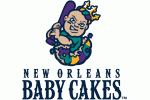
Man, it’s almost as if God decreed the Saints would have a good logo and then cursed New Orleans with never having a good logo for their city ever again. Of course, he’s sitting in a local “baby cake” and not a larva baby. Which everyone gets.
14. Colorado Rockies

I’m not saying the Rockies original logo was anything memorable but in comparison to this? Just a terrible font and boring faceless logo. Look at how the silver doesn’t extend through both letters completely.
13. Esbjerg fB
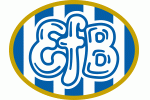
This Danish soccer team’s logo is straight out of Fat Albert and the Cosby Kids.
12. Kannapolis Intimidators

Minor league baseball back in the list again. Does Dale Jr. own stock in this club? Well, he should.
11. Catania

The thing about Italian Serie A soccer teams is that they are almost all awesome logos. Well, except for maybe Napoli and definitely this amateur hour crest. That’s a tiny elephant!
10. Lansing Lugnuts
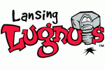
Let’s just say if you’re going to use a lugnut for a logo what expressions could you give it if you wanted to have some animated version? Angry? Happy? Serious? This minor league baseball team selected, “I pooped my pants.”
9. Philadelphia Passion
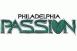
I believe women’s lingerie football technically counts as a professional league? This barely qualifies as a logo, though.
8. Nippon Tornadoes

This Japanese basketball team plays in the International League. I’d pay $50 just to be able to go back in time and be in the room when this logo was pitched to the owners.
7. Philadelphia Fury
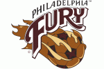
Is the ball melting? Is it covered in mud? Is it actually a chocolate chip cookie soccer ball?
6. Saskatchewan Rush
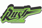
A Canadian lacrosse team is called “Rush” and they DON’T have a logo of a 360-degree Neil Peart drum kit?
5. Revier Lowen
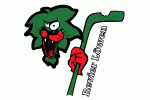
Okay, I included one team that is now defunct. This comes from the German hockey league and is so terrible and goofy it had to be included.
4. Jersey Blues FC
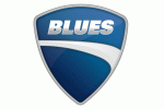
I haven’t actually found quality evidence that this National Premier League Soccer team exists. Nevertheless, they have perhaps the blandest logo in the world AND it’s a direct ripoff of Ducati motorcycles.
3. Warriors FC
![]()
This Singapore soccer team went through a re-brand and decided to put the world’s worst drawn rhino just all up on their logo.
2. Ogden Raptors

Sadly, during the last minute I found out this logo was recently updated. I’m keeping it in the list. This is 100% a logo that came after way too much cocaine in 1994 following a VHS viewing of Jurassic Park.
1. Michigan

Okay, we’ll allow one college program.
That last one really stings the eyes. Would douse in gasoline and light on fire.
Lol. I watched the Ogden Raptors defeat my hometown Great Falls Voyagers last night 🙁
Looks like it came from the Rugrats cartoon.
I’m going to disagree that the Jaguars have the worst logo in the NFL. Some are too iconic to change (Packers, Steelers, Cowboys etc.) but is there anything that screams low effort logo like the Browns logo? Seriously? It’s just a damn orange helmet. At least go back to the bulldog.
Agreed. I like the Jags logo, overall.
Definitely low effort for the Browns, but I’d still rather have that in comparison to Jacksonville.
The bulldog has only been a secondary logo. They should definitely go back to the Brownie the Elf logo!
BOO MICHIGAN
I can hate on the block M, but three other Michigan teams on the list? Ouch!
I kind of like that crazy Revier Lowen lion. Reminds me of Bill the Cat, “Aaaaaaack!” From Bloom County.
I figured the Philadelphia Fury had to be defunct, but apparently there actually is a second level pro soccer league out there. These guys must get paid about $50 per match.
Finally, kudos on ending the list well. And by well, I mean hideously.
The fact that the Philadelphia Passion is a women’s football team makes that logo even more worrisome. What is that second O REALLY supposed to be?
I registered so I could reply because I did a double-take too. It’s two footballs, but it must be intentionally suggestive because they could’ve just used one football, right? Or is it a heart and I’ve been on the internet too much?
Why U hating on the Minnesota logo? Best Block M in the big 10
This article didn’t look like much when I saw the headline, but it made me laugh out loud several times. Well done. That Revier Lowen logo is incredible.
Damnit I love (hate?) Jean Ralphio!
Saw a funny comment once that Jean Ralphio is the best and 🎵🎵🎵 the worrrrrrrst 🎵🎵🎵 tv character of all time.
Dante Fiero (aka Dennis Feinstein is also pretty great)
I kind of like the Vegas logo for the use of the negative space to make the “V”. Their owner has a weird Army fetish and was trying to name the team the Black Knights but couldn’t get all the agreements and blessings of the Army/government, so the name of “Vegas Golden Knights” is kinda off-putting and clearly a second choice type of name.
Also on their jerseys I’m fine with the gray/gold/white combo but they also have a little sliver of red in there too which really throws it off. To me that’s a lot worse than the actual logo.
Several of these logos look like they were done in MS Paint. By me. At least have the decency to hire ndmspaint to do the drawing if you go that route. Dude could draw a lugnut that would both terrify and enlighten.