
The judging of uniforms is back. I went through the Power 5 programs and noted a handful who desperately need a makeover. I originally had a list of 5 but decided to spare Mississippi State as they’ve made some solid improvements in recent years.
The others here today, not so much. Write in the comments your makeover submissions.
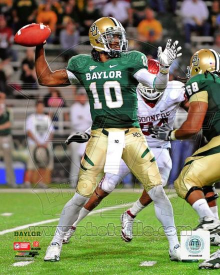
Baylor
Once upon a time, Baylor was a model program for how to pull off green and gold. As Robert Griffin III increased the school’s profile the Bears decided to start messing with their uniforms after he left and they’ve been on a twisted and poor sartorial journey ever since.
Baylor’s problems started in 3 areas. One, moving to a darker green. Two, embracing sandstorm gold. Three, generally adopting the Oregon plan* for little uniform cohesiveness from week to week.
*Ironically, Oregon is now a lot more uniform in their look than several other programs today.
Even with bold pants stripes, RG3-led Baylor looked super sharp. Also, don’t sleep on how good Baylor looked back in the day when Mike Singletary was prowling on defense.
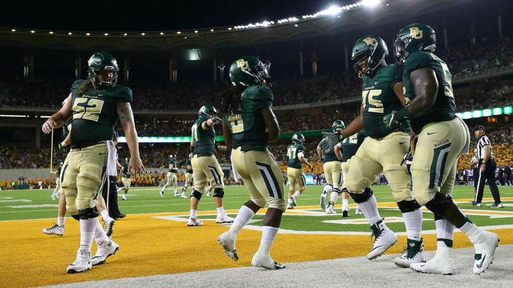
For 2018, Baylor wore 6 different helmets, 4 jerseys, and 4 pants and no combinations looked worth the effort. In fact, I’d say right now Baylor has the worst uniforms in their school history.
Something needs to be done. Embracing white numbers and a shinier gold feel like easy decisions if the school isn’t going to dial things back to a more throwback look.
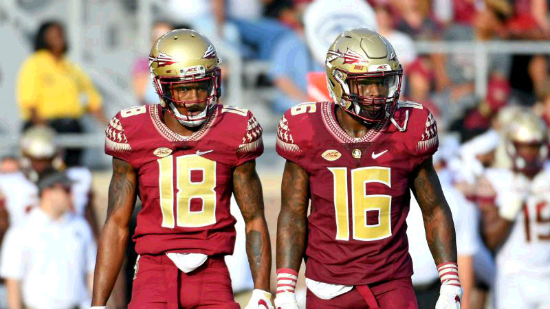
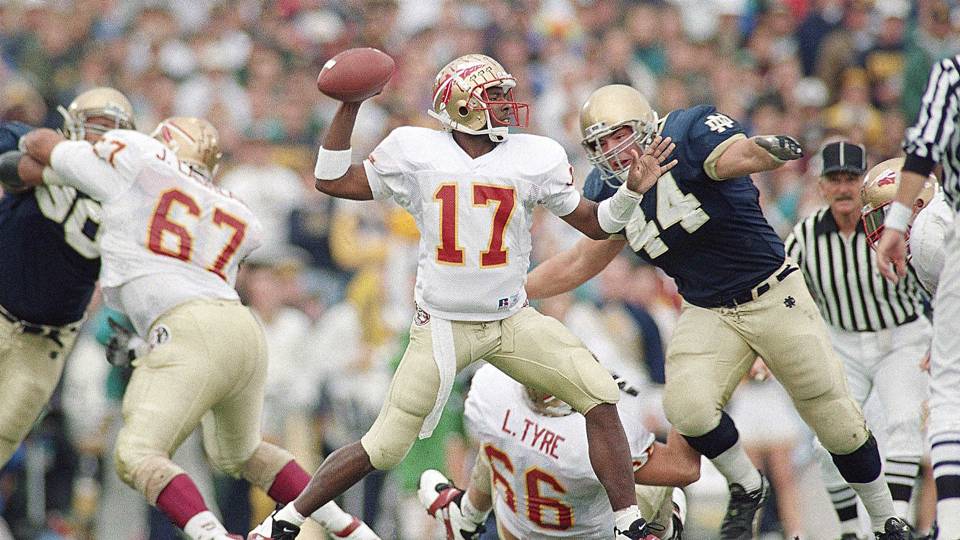
Florida State
I’m a big believer in a uniform change giving a team special powers to re-brand and win a championship. See the 1998 Denver Broncos and 2007 Anaheim Ducks as teams who won a title immediately after changing uniforms.
Florida State, on the other hand, won the 2013 National Championship and then decided it was time to mess with their uniforms after renegotiating their deal with Nike. I think some people have warmed up to their new look but I remember the re-brand being universally panned by critics.
It didn’t help that the Seminoles briefly wore these hilarious road jerseys with gold numbers that caused everyone to squint just like Jameis Winston. Also, notice that bright almost neon manila helmet from early 2014 in the above link? Yup, those were boo’d off the field and later scrapped.
Seems like if you do a re-brand and immediately have to make significant changes things didn’t go well.
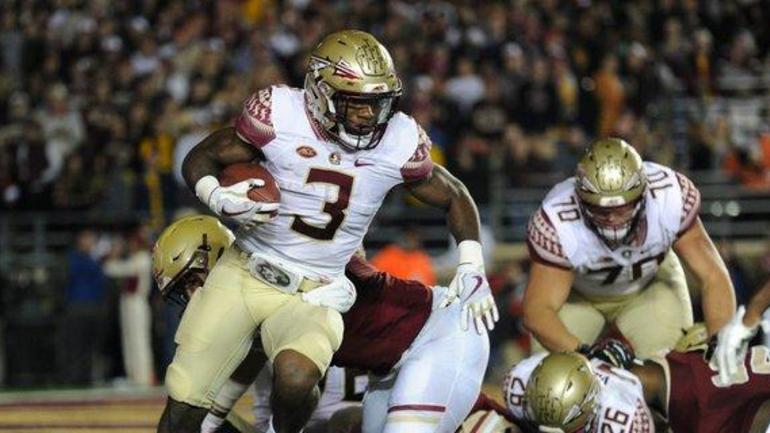
Back when the Seminoles visited South Bend in 1993 their uniforms were underrated for their simplicity. Their jerseys were about as plain as you’ll find and only the Seminole hip patches and tomahawk helmet stickers provide a little flash. By the late 90’s, they added a Seminole pattern to the collar and sleeve for one of the sharpest looks in college football.
Now, FSU has the weird hieroglyphic patterns plastered all over their jersey and the gold numbers ruined what used to be one of the best home uniforms in college football.
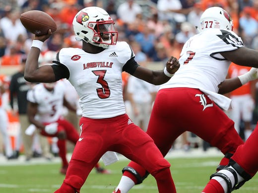
Louisville
I will say this nice thing about Louisville first. Their 2018 traditional home uniform inset below actually isn’t that bad. But I’m being kind and it’s a low bar because overall the Cardinals have a heinous set of uniforms.
To be fair, Louisville has found it difficult to settle on a strong identity. They used to look like NC State and the Arizona Cardinals had a baby. They really led the way in many areas for moving toward a bold look that is so early 2000’s that it hurts (love those numbers though to be honest).
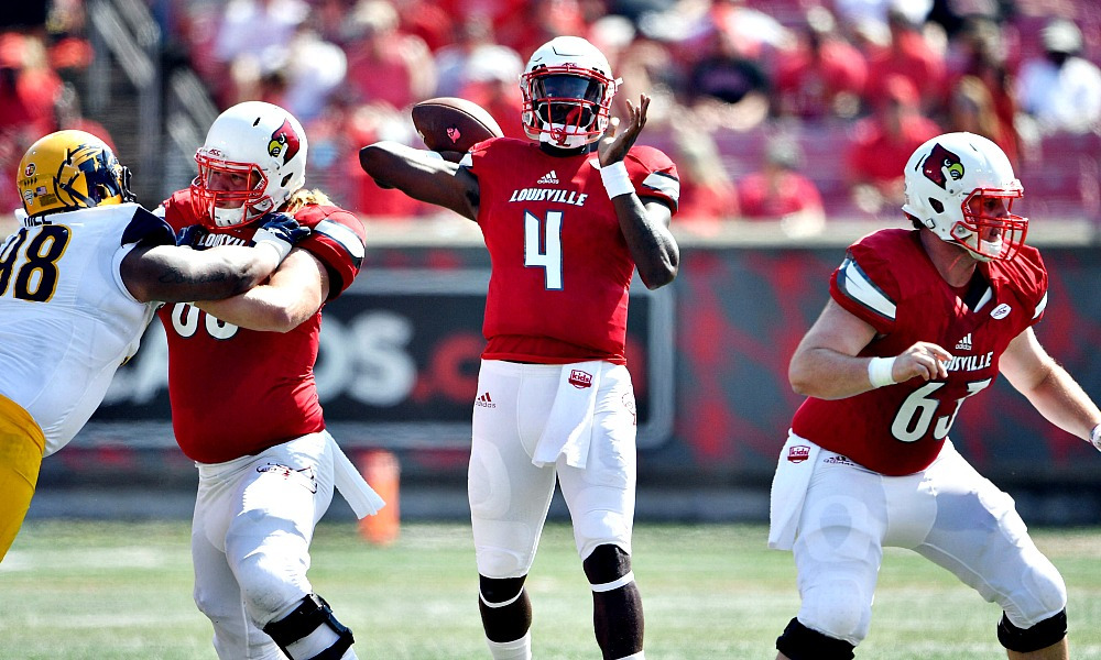
Adidas has ruined many uniforms throughout the years and even though they’ve come around to improve several programs (Miami, most especially) Louisville is still out there crying for help.
Look at THIS uniform for goodness sake! The Ed Hardy hip logo! The iron-on numbers! The tiny script! The dumb bird wing on the shoulder!
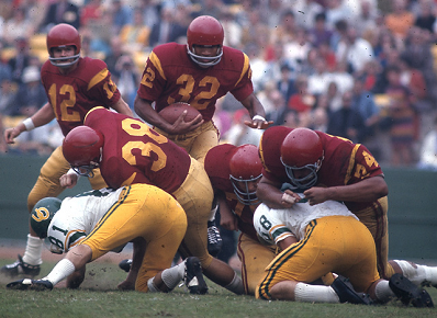
USC
Is this the most overrated uniform in college football?
I’m personally not a fan of this color combination especially when there’s another major conference team that looks so similar. If you were starting a college program today this would be one of the last colors you’d want to pair together. Perhaps the colors of a trojan warrior are important to mimic but if that’s the case maybe USC’s helmets should be gold or at least bronze colored like THIS guy?
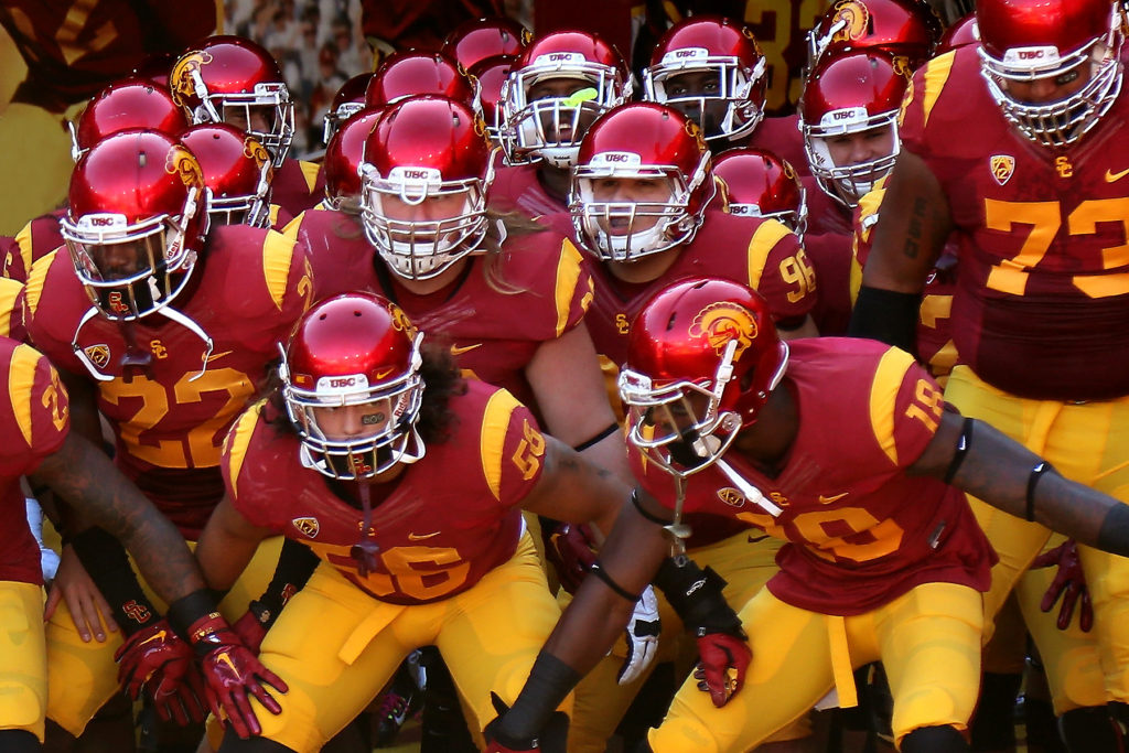
I think the really boring shoulder stripe bugs me more than it should. I know that tradition goes way back but come on USC didn’t even use a helmet logo in those days. The stripes used from the 1970’s through the 1990’s was a far better look, too.
USC’s helmet deserves far more criticism, in my opinion. Their logo is really blob-y and hard to make out from any distance. They’ve used it for years and it’s never felt like a college football tradition worth keeping. I’m a Tommy Trojan truther and think it looks better. But something else would work better than the current version.


Definitely agree that FSU’s look like butt.
I don’t want USC to change, mostly because I want them to continue looking like they belong in the 1970s.
Their ugliness is one more reason to beat the crap out of them.
Kinda neutral on the other two, though Baylor has taken Oregoning to a level that Oregon’s like “whoa, slow down there.” I liked their super-shiny helmet look, but some of the others suck.
I do like some of Baylor’s chrome helmets, too.
We are all just collectively not considering Mizzou a Power 5 program now? Very smart.
Lay out your concerns, sir.
I can’t embed the images from here, but most of this past year’s unis are basura:
https://www.columbiamissourian.com/sports/mizzou_football/make-an-impact-are-all-those-missouri-uniforms-fashion-dos/article_286c2468-ed0c-11e8-8a53-c7200d402a66.html
Also, through 11 games, they wore 11 different uniforms. They somehow don’t have an actual standard uniform AND they need to change.
They’ve worn these a couple times with the different color tummy-patch. Regrettably I can’t find a picture of any of the larger players wearing this one.
Excellent use of the word “basura,” sir.
I’ll stick up for them a little bit.
The mixing and matching, I get that criticism. I think their colors work really well to do it, though.
A few of their helmets ruin the whole uniform for that particular week. Overall though, I think they have a strong identity despite changing things up. Looking back at the Chase Daniel era my goodness do they look like Southern Miss and such awful piping everywhere. I don’t know enough about their distant past to say what’s a good throwback or traditional look for them.

I think that’s a fine, maybe above average look in college football.
Nah, man. Their pants don’t match the rest of their scheme in this photo.
Font sucks.
Tiger logo is early 2000’s generic.
Plus negative eleventy billion points for the field at Faurot..
Also, no knock on FSU for the SS logos?
That’s what I described as their weird hieroglyphics pattern.
I’m going to go ahead and disagree with you, Eric, on the Trojan uniforms. I mean, USC sucks, as we all know, and their admissions office is apparently for sale, like everything else in LA, but they do have a classic look. Unlike most college football teams, including us, they have not gone the way of alternate uniforms and “exciting” new looks. I think those candy/pearl helmets look really good, adding just enough bling to the classic design.
I agree with you on the others, though, and would like to echo Drick’s calling out of Mizzou’s terrible uniforms. This article of yours leads me to reintroduce my suggestion that we have a throwback year, where every team wears only their classic home/away uniforms from the pre-Uniformania (TM) era, like the NFL 75th anniversary uniforms. I’d be more interested to watch that than to see who’s trotting out their tenth uniform combination for their Wednesday night game in October.
We’ve got a bit of a circle-jerk going on here. I agree with IrishTexan in that the USC unis aren’t bad. I don’t personally love them or the Scarlett/Gold color combo, but they are what they are. If anything, IA State should get the axe, not USC.
In summation, Mizzou’s unis suck.