
Why do NFL teams change their uniforms? From the current franchises Baltimore, Carolina, Chicago, Dallas, Green Bay, Houston, Indianapolis, Kansas City, Las Vegas (this feels weird to type), New Orleans, Pittsburgh, Tennessee, and Washington have all kept a consistent aesthetic for a considerable amount of time. That’s 13 teams so about 40% of the league. The other 60% of the league has done some things that make you shake your head, though.
I’ve scoured through the pictorial history and come up with the 12 most inexplicable uniform changes in the NFL. A few to include that just missed the cut:
Atlanta 2020 – I’ll wait and see until this takes the field but right now it looks like a massive step backwards and absolute lock to make this list if it were done a year from now.
Cincinnati 2004 – The previous versions were okay and these newer ones just not bad enough.
Los Angeles Rams 2020 – Name tags? A jersey colored bone? WTF?
New England 2000 – I love the 90’s Patriots uniforms and aesthetically this was disaster but winning has blinded many, and I include myself in that assessment.
San Francisco 1996 – This got dangerously close to ruining everything but didn’t stray too far from their glory days.
Tampa Bay 2014 or 1997 – I’m agnostic about the creamsicle uniforms and actually thought the ’97 change was unique in its own right. The 2014 change with absurd numbers was a mistake from the beginning.
The Top 12 Worst NFL Uniform Changes
#12 1988 San Diego Chargers
In a vacuum these uniforms are completely fine. The Chargers kept their signature bolts on the helmet and shoulders while opting for a more traditional pant stripe. All in all, still pretty sharp in a traditional model.
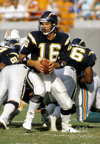
Still, this was like the 3rd or 4th different shade of blue the Chargers had used since their inception and they kept changing to a darker blue finally culminating in this navy shade. Don’t change one of the great NFL uniforms.
#11 2002 Seattle Seahawks
This blue-green color the Seahawks trotted out for several years may be among the worst decisions in league history. Seattle actually had really sharp uniforms prior to this that were underrated primarily because the team wasn’t very good and didn’t get enough attention.
Going all-blue monochrome at home made things so much worse. Thankfully, the franchise ditched this look after a decade and while their current set has its own faults they are miles better than this attempt.
#10 1978 New York Jets
A common theme are teams messing with a sure-thing. A timeless classic. So enter the late 70’s Jets who couldn’t help but take four steps backwards.
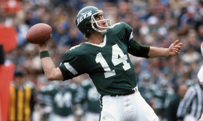
Although not as egregious as another green team coming up, turning away from their bright green was a fail. When I look at these I think of rock hard astro turf, terrible quarterback play, and 1980’s New York City crime.
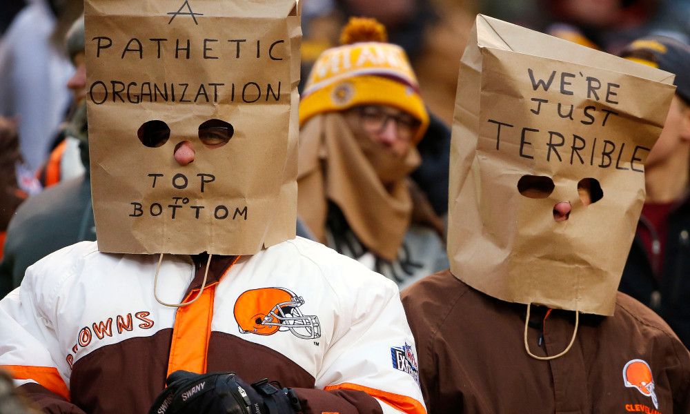
#9 2015 Cleveland Browns
These should be higher! But wait, there’s actually a lot to like because the Browns colors are awesome and at least they didn’t mess that up. If you squint, it’s possible to see a great uniform.
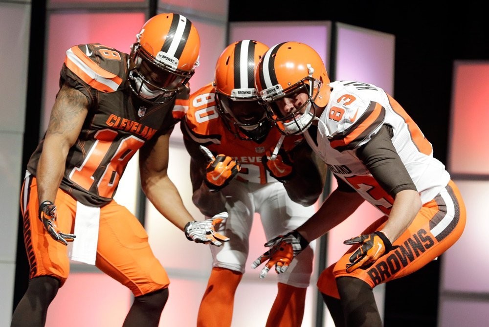
Of course, that truncated pant stripe with the word mark, plus that extended shoulder/chest stripe created a laughingstock across the league. Several teams made it through the required 5 years before immediately changing uniforms again and the Browns at least corrected things this off-season.
#8 1997 Denver Broncos
Are these popular in Denver? I’ve always thought since the Broncos won a pair of Super Bowls immediately upon switching uniforms that they hold a special place for fans. I like to think of them as the poor man’s version of the Patriots uniform switch a few years later.
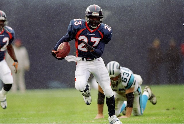
The Broncos original uniforms were just so damn nice and I’m shocked they still wear these vestiges from the 1990’s. We’re coming up on a quarter century!
#7 2006 Minnesota Vikings
Any time you can take one of the iconic road uniforms in football history and switch to something a decade old when first released, you’ve made a terrible mistake.
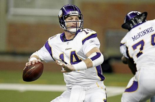
The Vikings have since moved on from this, and while their new sets aren’t as great as the originals, they are actually very sharp and a major upgrade.
#6 2005 Arizona Cardinals
Truly, the Cardinals uniforms before this were nothing special. Their road uniform had the Arizona flag patch on the arms which was cool. Beyond that, Arizona has always had Generic Football Team uniforms.
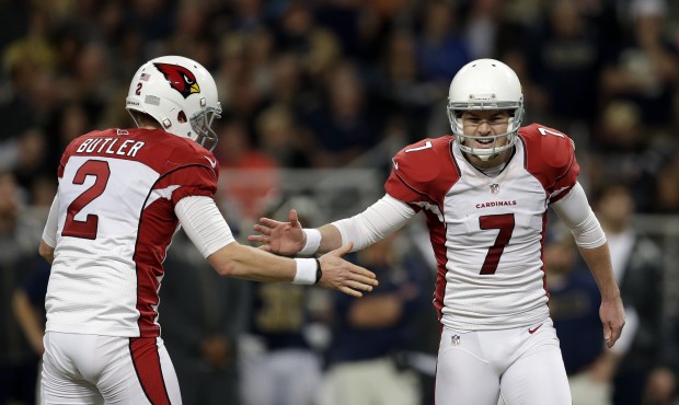
Except now, they have Generic Football Team uniforms with a piping and flank disaster. Out of all the jerseys in the NFL this may be the one I’d be the least excited to wear as a fan.
#5 2013 Jacksonville Jaguars
Do we really need to say anything?
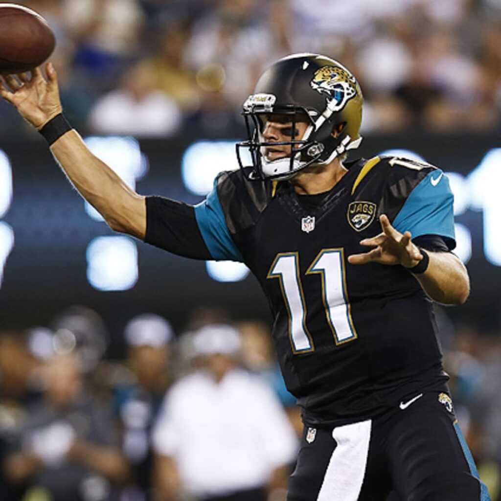
Hey, look the Jags pioneered the name tag!
#4 1996 Philadelphia Eagles
Is it green? Is it black? If we’re just talking about changing the shade of a color this has been the biggest mistake in NFL history. The Eagles eventually came out with a black jersey so why not just use that instead of splashing all this dark green and black together?
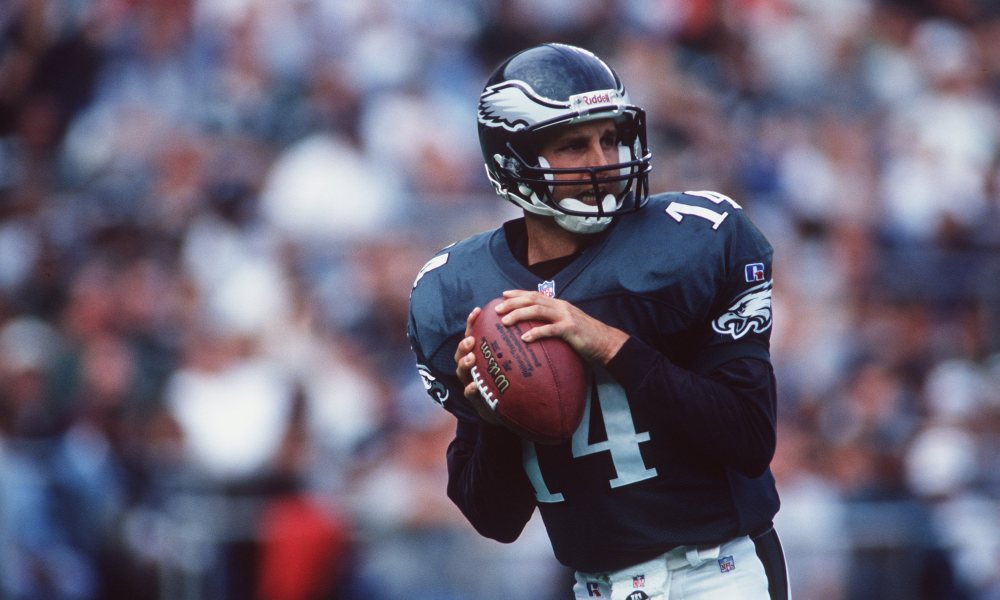
This has been such a shame. Once upon a time, the Eagles had such a unique kelly green and silver uniform that was the envy of the league. I hate this.
#3 2000 St. Louis Rams
Any time you win a Super Bowl and immediately change your uniforms I am questioning your motives and decision making process. In the case of the Rams, they made the mistake of not only dampening one color but both their royal blue and yellow.
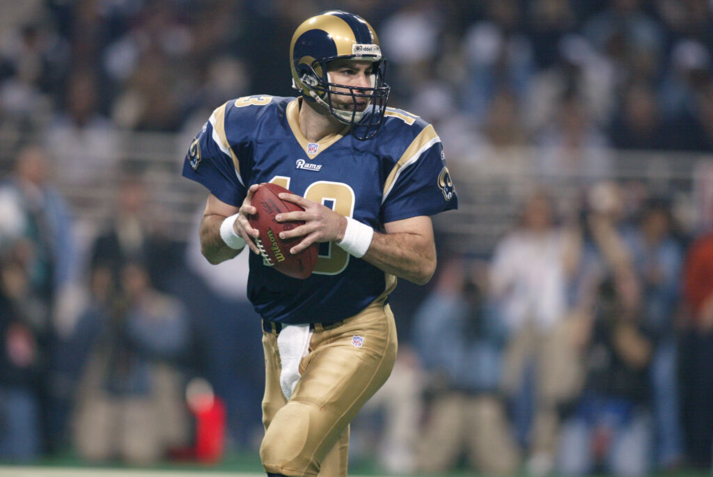
Obviously, the Greatest Show on Turf never won another Super Bowl and eventually the Rams moved to Los Angeles. This all happened because of this stupid uniform change.
#2 2002 Buffalo Bills
The Bills wore these uniforms for 9 whole years. The entire time, I couldn’t believe it was happening. I expected to wake up from a fever dream and realize this was not reality.
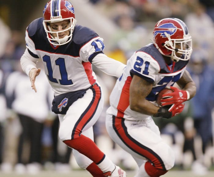
Truthfully, the home version of these uniforms was fine. This road set oh my goodness what an embarrassment to football players everywhere. I’ll never understand the need to mix the navy blue and royal blue in such a clashing way, nor why the flank stripes don’t match the pants, nor why they decided on the most absurd blue shoulders.
#1 2013 Miami Dolphins
Do you know how hard it is to pull off a teal and orange uniform with a damn dolphin as the mascot? Miami achieved this early in their franchise history! You had it! You took one of the hardest things to do, made it work, and had one of the most unique looks in North America.
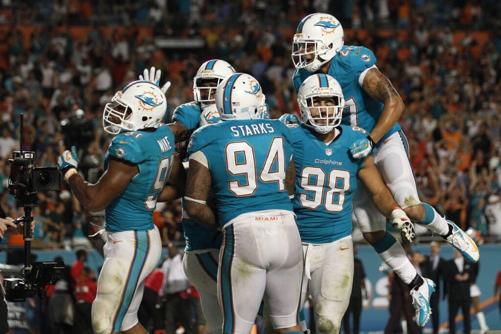
Then utter disaster struck. These are a combination of boring, ugly, tacky, and part of a fad in football that needs to die quickly. The Dolphins have worn these for 7 seasons so far and there’s no way they make it past a decade, right?

Hard to argue with your top two choices. The Jim Kelly-era and Dan Marino-era looks for the Bills and Fins respectively were among the best in the league and I still don’t understand why they went away from them.
I’d have Tampa’s Jameis-era change in the top 3 somewhere. I think the Bucs’ 1996-2013 uniforms were the best in the league: Unique, gorgeous and completely Tampa. That change is, to me, the most heinous of all. Even the new ones that largely go back to that style aren’t going to be the same.
I was never a big fan of the old Bills uniforms if only because they were a red-helmet version of the Giants uniforms of the time. Super XXV was weird. But yeah, the change was really bad.
I didn’t know someone loved the 96-13 Bucs uniforms so much!
I’m a sucker for any team’s look that does something that no one else is doing and makes it look great. Pewter and gold was a weird idea, but executed to perfection. Which isn’t to say I don’t also like the Creamsicle look a lot.
I do agree with that. Pewter was an amazing creation.
Aside from the 8pt “Dolphins” on the front, what’s unappealing with the Miami uni? I don’t know that I have a feeling either way towards them, aside from the hidden team name.
I am #TeamOrange and think that any team with orange as a color should us it a bunch, which these unis aren’t doing.
By themselves, they’re actually fine. But the aqua shade is wrong (the throwbacks they wear once or twice a year are what they should wear), the helmet logo is a downgrade, and the font is pretty lame.
This sums it up well. I kind of graded based on how awesome the previous sets were, too. So if a crappy uniform got even more crappy to me that’s not as bad as what the Dolphins did going from an iconic uniform to something maybe not terrible but pretty bad anyway.
Hmm..I guess I like the darker aqua better. I feel like the lighter aqua is a bit too toothpastey to me. Lack of orange, especially as outlining/piping is my bigger gripe.
The two LA teams wearing basically identical uniforms this year is going to be weird. I’d love to know how those design choices came to be.
I’ve always thought that of all the sports leagues in America, the NFL has struggled the most To consistently put good uniforms on the field. Most teams seem to struggle to even put a good throwback uniform on the field, which should be simple. Just pick the most popular uniform your team has worn in its history, and bust it out again for a special occasion. Instead, some teams go with really crummy old uniforms, or weird throwbacks that are close to but not exactly the same as the original uniform.
Saves costs on the banners at SoFi Stadium.
Next article needs to be 12 Dumbest Stadium Names.
In no particular order:
Talking Stick Resort Arena Phoenix
Vivint Smart Home Arena Salt Lake City
Smoothie King Center New Orleans
Rocket Mortgage FieldHouse Cleveland
Golden 1 Center Sacramento
TIAA Bank Field Jacksonville
Empower Field at Mile High Denver
Guaranteed Rate Field Chicago
Globe Life Field Arlington, TX
Truist Park Cumberland, GA (ATL)
It’s only 10, but I have a beef with 2 different stadia sponsored by the same sponsor (Mercedes in NO & ATL – American Airlines in MIA & DFW – AT&T in San Antionio & DFW)
Half of these are fake, I’m sure of it.
Here’s some of the best defunct arenas/old names of current arenas:
Pengrowth Saddledome Calgary
Cow Palace San Francisco
Stampede Corral Calgary
Checkerdome St. Louis
HemisFair Arena San Antonio
Salt Palace Salt Lake City
Palace of the Fans Cincinnati
Sportsman’s Park St. Louis
Swampoodle Grounds Washington, DC
Hoosier Dome Indianapolis
And the ultimate hat-on-a-hat name:
Auditorium Arena Denver
18 Stripes: Come for the music content, stay for the uniform content.
Would love your rankings of the best throwback unis across sports (all of them). Apologize if this has been done already.
Would that include college teams?
Yes. Literally all throwbacks ever. You could include high schools and rec leagues if they happen to have throwbacks. THE DEFINITIVE AND ULTIMATE LIST.
“Pittsburgh Pirates!”, said nobody.
Breathtaking
Pillbox hat forever!